Contents
The WooCommerce add to cart buttons are often designed by the theme developer. Sometimes, the default button styles provided by the theme doesn’t suit your need. That’s when you need to do something to change the add to cart button styles. But how?
We are going to use a plugin called Ultimate Custom Add To Cart Button to customize the buttons on your WooCommerce store. This is the plugin I develop so I would love to have your feedback. The plugin is free to use and there is a pro version available here which has additional cool features (Which also has a $20 discount at this time).
Now, we are going to learn how to customize the add to cart button for your site.
Change the add to cart text
I have covered how to change the add to cart, read more, view products… text on the buttons in this post. You can have a look at that for more details.
We are going to add the cart icon to the add to cart button. As you can see now, my buttons don’t have any icon.
![]()
Now, we go to Ultimate ATC Button to add a cart icon to that.
I’m going to use a shopping cart icon. So, I enter the text shopping and you can see that, the list of suggestions shows:
![]()
I select the last option, fa-shopping-cart and scroll down to the bottom then click on save changes.
Now, if I reload the product page, I will see the cart icon in the button:

With this plugin, you can easily change the background color of the button too.
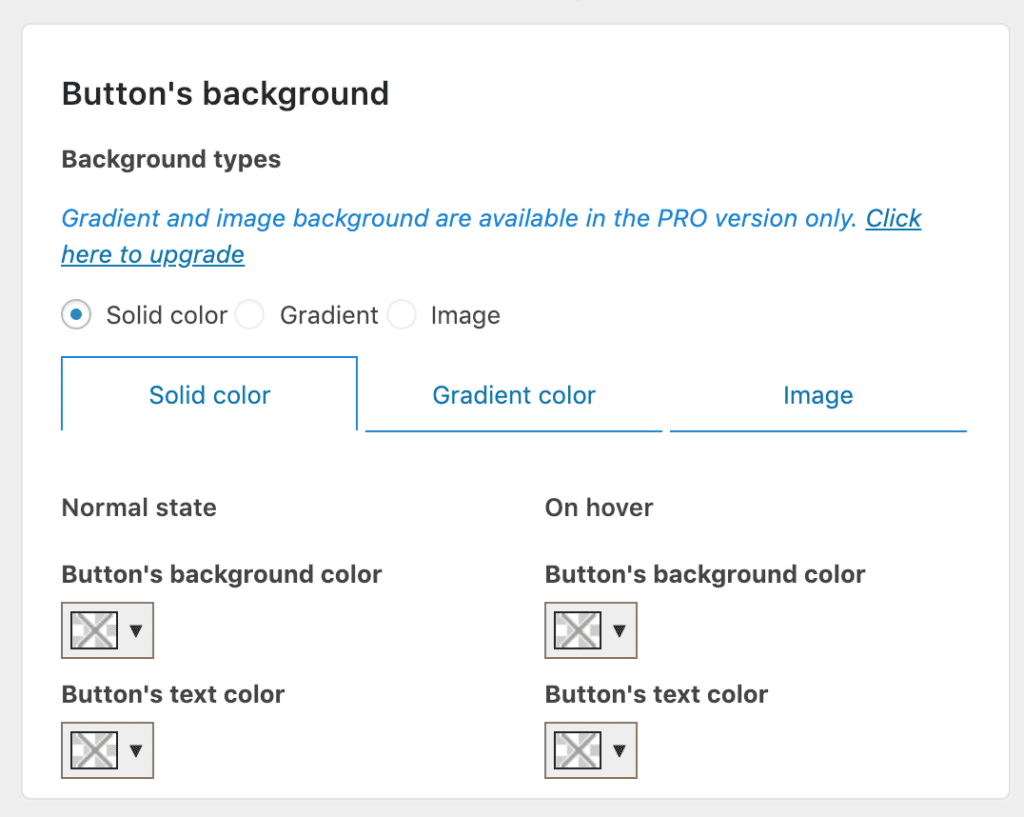
The options are straightforward. You can pick whatever color you want for the button’s background. For example, I’m going to use the blue color for the button:
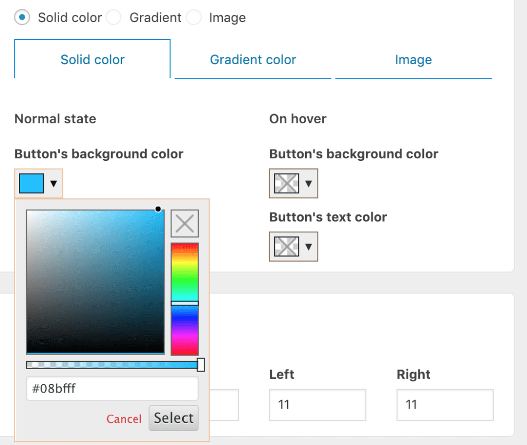
Now, I click on save changes and view the results:

As you can see, the text color doesn’t work really well with this background. You can change that too with the text color option in the plugin:
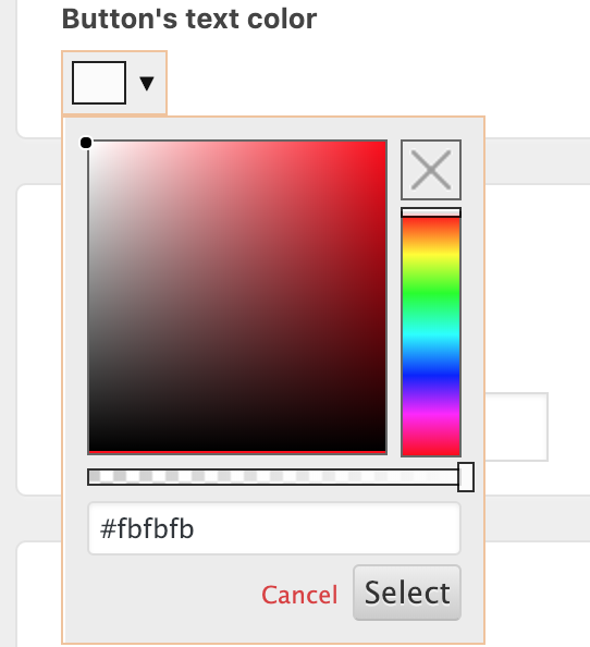
If I reload the product page, I can see the text color has changed:

If you are using the pro version, you can change the background to use a gradient or an image too.
The last section in the plugin allows you to customize the add to cart button’s padding and margin. You can enter your desired values here (in px) to adjust the button’s style. For example, I set the margin and padding for the button to 20px as in the image below:
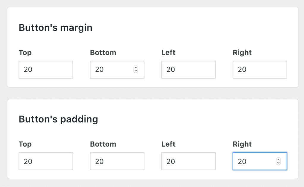
Now, if I view the product page, the button has changed accordingly:

In addition to let you change button’s styles, you can do the following in the pro version:
- Set an image as the buttons’ background. That means you can use an image to replace your add to cart button
- Remove the up and down arrows in the quantity input box
- Completely change the style of the input box (add plus and minus buttons to increase and decrease order’s quantity)
Click here to find out more about Ultimate ATC Buttons PRO
As the time I write this post, almost all themes support a section called Additional CSS (You can access this panel by clicking on Appearance->Customize). This is the place you can add additional CSS to your site. If you know CSS and confident in your CSS skills, it’s not a big problem to add background color, hover color or even gradient on the background. The important thing is to get the selector of the button. The trick is to use the inspection tool of your browser.
Let me show you how:
As you can see, if you know a bit of front end web development, this is the easiest way.
However, not all people can do that. I would recommend you use my plugin above to achieve the designs much quicker and easier.
Conclusion
As you can see, there are quite many options for you to change to tweak the styles of the button. If there are settings you need that aren’t available in the plugin, please let me know and I’ll add that to the plugin.



![[Solved] Woocommerce Shipping Zones Not Showing In Cart and Checkout Page](https://www.binarycarpenter.com/wp-content/plugins/related-posts-thumbnails/img/default.png)